The New POLITICO pro
Posted on September 21, 2012

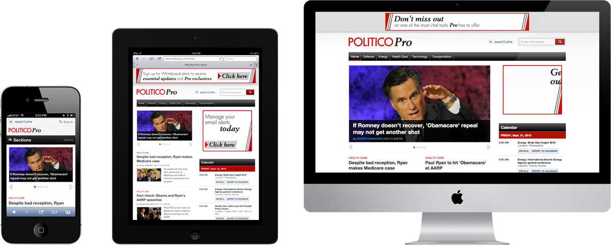
I’m very happy to announce the responsive redesign of POLITICO Pro - POLITICO.com’s premium service for policy news, launched Sept. 10, 2012.
This post is rather lengthy, no, it’s VERY lengthy. I want to explain much of what we went through over the course of the project - from the decision-making process to go responsive to how it was designed, developed, and launched. Our deadline was 8 weeks from beginning to end, so the way we approached each phase had to keep that in mind for better or worse. My goal here is that you will walk away with some insight on how you can approach building a responsive site for your organization, or perhaps some things to avoid.
A little background
I’ll go out on a limb and say there’s a very good chance that you don’t have a subscription to POLITICO Pro. So here’s the deal. It isn’t a typical news site. Stories tend to be a bit more granular than what the general public may appreciate, or even want. I don’t mean for that to sound condescending, it’s geared for a different type of consumer. Consider it as more of a tool for staffers on the hill, lobbyists, and those who need detailed policy news for their jobs, as it happens. It’s exclusive, and intentionally so. Subscriptions start at $3,295/yr. for one vertical and go up from there, according to Nieman Journalism Lab
POLITICO Pro launched in 2011 with subscriptions far ahead of what was projected. After a year, it was evident that the formula was successful. Renewal rates are hovering around 90% with new subscribers added continually. Pro’s editorial team has added new reporters and expanded coverage into new areas. The site was soon becoming too big for its britches.
Why go responsive?
After the decision was made that Pro was going to get an overhaul, we outlined some basic requirements. Mobile support was a must, as the previous site offered none. It had to accommodate additional verticals as publication grew. The existing design and codebase couldn’t fit more than the original scope. It also needed a homepage that would aggregate all top news that each member was subscribed to.
We weighed a few options on how to go about accomplishing this: a) seperate mobile site; b) native apps; and c) responsive. We looked at the pros and cons for each. My team definitely had a preference towards going responsive, but that’s just us. We still needed to build a case for the organization – and talk about bottom line.
Creating a separate mobile sites or native apps is a familiar process to us. But it would require extra projects that need to be designed, reviewed, developed; and then over time, maintained. Native apps would also mean we’d have to get resources from our mobile developers, adding to the total man hours. The byproduct of this approach is that it creates a pecking order, with the main website usually enjoying preferential treatment when it comes to changes and new features. Those second-class products can easily fall behind, especially when times are busy.
It became pretty clear that it would be too expensive NOT to go responsive
Making the decision
Responsive web design isn’t just a design decision though. It’s equally a business decision, if not more so. The workflow process across the organization was going to undergo a massive shift. We had to communicate this clearly, being honest and realistic. After all, it was new to us too. We needed buy-in from everyone - editorial, sales, advertising, and developers. If any one of these teams determined they could not make it work, the entire project could have been derailed.
Developers
We had two major hurdles. One was a change to the CMS that would allow for building pages from a variety of structures and widget placements, which didn’t have much to do with me. The other hurdle was much more interesting because it dealt with the ad issue. Even though POLITICO Pro is a paid service, companies buy out sponsorships on occasion. In regard to the leaderboard, we had to ensure that the appropriate ad would show at specific viewport widths. We didn’t want to load multiple ad units in one slot and then use media queries to show one and hide the other. The user would have to download unnecessary resources. Not cool. The ad code would only fire once, so if a 728x90 ad was loaded, we had to hide it if the viewport was narrowed beyond that threshold.
The ground rules were this:
- If loaded with width between W and X - Load ad 300x50
- If loaded with width between X and Y - Do nothing until IAB standard unit is available
- If loaded with width between Y and Z - Load ad 728x90 (if user loads 728x90 and drags viewport below 728px wide, it’s okay to hide the ad via media queries to prevent breaking the layout)
I built a quick prototype to illustrate idea, but the developers did the real heavy lifting to make it functional.
Advertising
I took my prototype over to the advertising team, demonstrating what happens to the main content blocks, and the ads within them, once the viewport is adjusted. Next, I showed them how the leaderboard ads reacted, and that their team would need to request advertisers to provide artwork in different sizes.
Since POLITICO Pro is a paid-service, ads aren’t as central as they are with our main site. But because of sponsorships, we needed have a workable solution in place that wouldn’t create any drawbacks. The advertising team was very receptive to everything that was being proposed, and even mentioned that advertisers get excited about these kinds of projects.
Editorial
We already decided that we wouldn’t be upheaving the site’s existing structure, so we didn’t need to go as far back into the exploratory phases. Again, small timeframe. Building upon the original prototypes, we added elements – unadorned – that represented a typical vertical front on POLITICO Pro: top stories, automated feeds, navigation bar, widgets, etc. Then we demonstrated how each item reacted as we adjusted the viewport. It wasn’t pretty to look at, but it delivered the point.
The prototype demonstrations were very effective. Editorial is rather sensitive to character counts and the way elements line up on the page. This is easy to control in a fixed-width design. However, that can be difficult to achieve on a fluid grid and we were able to show why. Our prototypes allowed us to demonstrate exactly how the text would flow and explore any what-we-do-this suggestions right on the spot. Had we used printouts, I’m not sure we would have gotten our points across as effectively.
Sales
The sales team is separate from advertising. They are the ones who go out and sell the subscriptions. Of all the teams, they were probably the easiest buy-in to get. POLITICO Pro, as it stood, was in terrible shape. It didn’t function well on mobile devices either. In my opinion, it didn’t quite reflect the premium service they were supposed to be selling. We framed our proposal around the idea that a responsive website is something that can really entice potential subscribers. They could bring iPhones, iPads, Androids, laptops, and hell, even BlackBerries to a sales presentation to demonstrate how each piece of content on the desktop is available in their hand, and nicely formatted to boot. Subscribers would not need to worry about losing access to features or content when they’re on a mobile device (which is still quite common), nor would they need choose between pinching to zoom in or holding the handrail for dear life on a WMATA train.
Green Light
I was surprised how enthusiastic everybody was so early on. I guess I had expected to receive more resistance than I did. But we got the green light, and it was time start moving. I had 4 weeks to deliver markup to the developers (they would be working on the CMS during this time), and we still needed a design.
Design
For this phase of the project, we had one week to get a final design aesthetic completed and approved. This is where we finally opened up Photoshop and started adding fidelity to our existing prototype. Being that we really didn’t have much time, Michael, Chris, and I came up with three directions in which we could go. One option was more in line with the POLITICO main site; the other was a refined version of the existing Pro style; and the third was the “wildcard” option. We mocked up only one template for each, which would serve as a baseline for every other page on the site. The focus was more on individual elements rather than an actual page. For posterity, we also also mocked up a mobile version of those elements with the caveat that they might not be fully accurate.
Although a final design was chosen within the deadline (one that was closer to POLITICO main site), I would probably single out this phase to do differently if I could. I don’t think we spent nearly enough time exploring our concepts to their potential.
Development
I think I’ll do everyone a favor and skip the minutiae of this phase as this post is long enough already. I’ll focus on a few items that I feel are important.
The Grid
We use a 12 column grid. One of the reasons we like using 12 columns so much is that it allows us to divide the site into 3 or 4 main columns. However, when retaining fluid grid at 12 columns, we ran into a situation where the 300x250 ad was too wide to fit inside its container. While width of the grid is fluid, the width of the ad remains constant. Andy Clarke’s method illustrated in 24 Ways was a lifesaver. At certain breakpoints (determined by the design, not a device of course), our 12 column grid snaps down to 10 columns, then 8, and then 4. Gutter and column widths remain the same. All I’m doing is measuring the percentages from the new maximum number of columns. It’s more work, but it preserves the design.
Stories
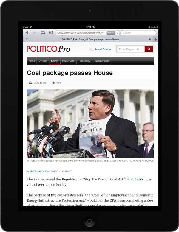
I think my least favorite layout would be what you get while holding an iPad in portrait mode. That 300x250 ad at the top of the rail takes up too much space to allow the main content to stand out. It was important to me, and hopefully the reader, that stories would pleasant to read. I wanted the text to live by itself without getting muted by 10,000 items begging to be clicked. Through a class name on the
<body>
Massive Tables
Tables are big problem for responsive sites, and I don’t think a one-size-fits-all solution is realistic. POLITICO Pro has one of the largest tables I’ve ever had to work with, called Exchange Watch. It’s a roundup of health care legislative efforts across the country. There’s about a paragraph descriptor and a list of articles associated with each state. Yeah, it’s massive, and redesigning it, unfortunately, wasn’t in the scope of the project.
I’m going to provide write-up on how we achieved it, but I will say that we borrowed very heavily from Chris Coyier’s approach.
Images
Images are cut at two sizes, depending on placement. They are a tad larger than necessary, and then we scale them down so pixel-dense displays aren’t as blurry. I know that there are some interim solutions available until a responsive image solution becomes part of the official HTML5 spec. From my experience, I’m hesitant to implement any fix temporarily when a permanent solution is around the corner. Across an organization, those temporary fixes can be difficult to unravel.
Testing
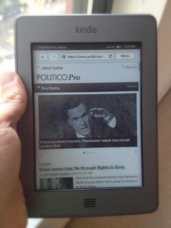
Being in a company of around 200 people, we are fortunate to have a rather deep pool of devices to test: iPhones & iPads with all versions of iOS, Android phones and tablets, BlackBerries (Curve, Bold, Touch, etc.), Kindle (Fire, Touch, Keyboard), Windows, Mac, and a bunch of browsers. What we didn’t have, unfortunately, was a Windows Phone or video game system browser on hand (I'm curious to test those out when I get a chance). Our web producers spent close to two weeks publishing content, testing the limits of every element in every way. Using bugzilla, they logged anything and everything that appeared a little off. Of course, there were a few items that weren’t legitimate bugs, but they caught a lot of what we had missed.

In Closing
As far as inhouse environments go, decision-making can often be from the top down. If someone from upper management has a preference for something, that person will probably get his or her way no matter how arbitrary that is. Designers tend to be viewed as ones who take directives and make them as visually pleasing as possible, and are not heavily involved in constructing requirements. I think with Pro, we did experience a bit of that - but not to a large extent. Through meeting daily and working iteratively, we had a chance to communicate why we made the decisions we did with managers and editors in ways that we couldn’t in the past. They were able to gain a much deeper understanding of what goes into building a website: what’s easy, what’s difficult, what’s impossible, and how we can work better together through complicated problems. End result: designers play the role they should.
Over the next few months, we’ll be adding tons of new features to PRO. I’m excited about how this will continue to grow and evolve.